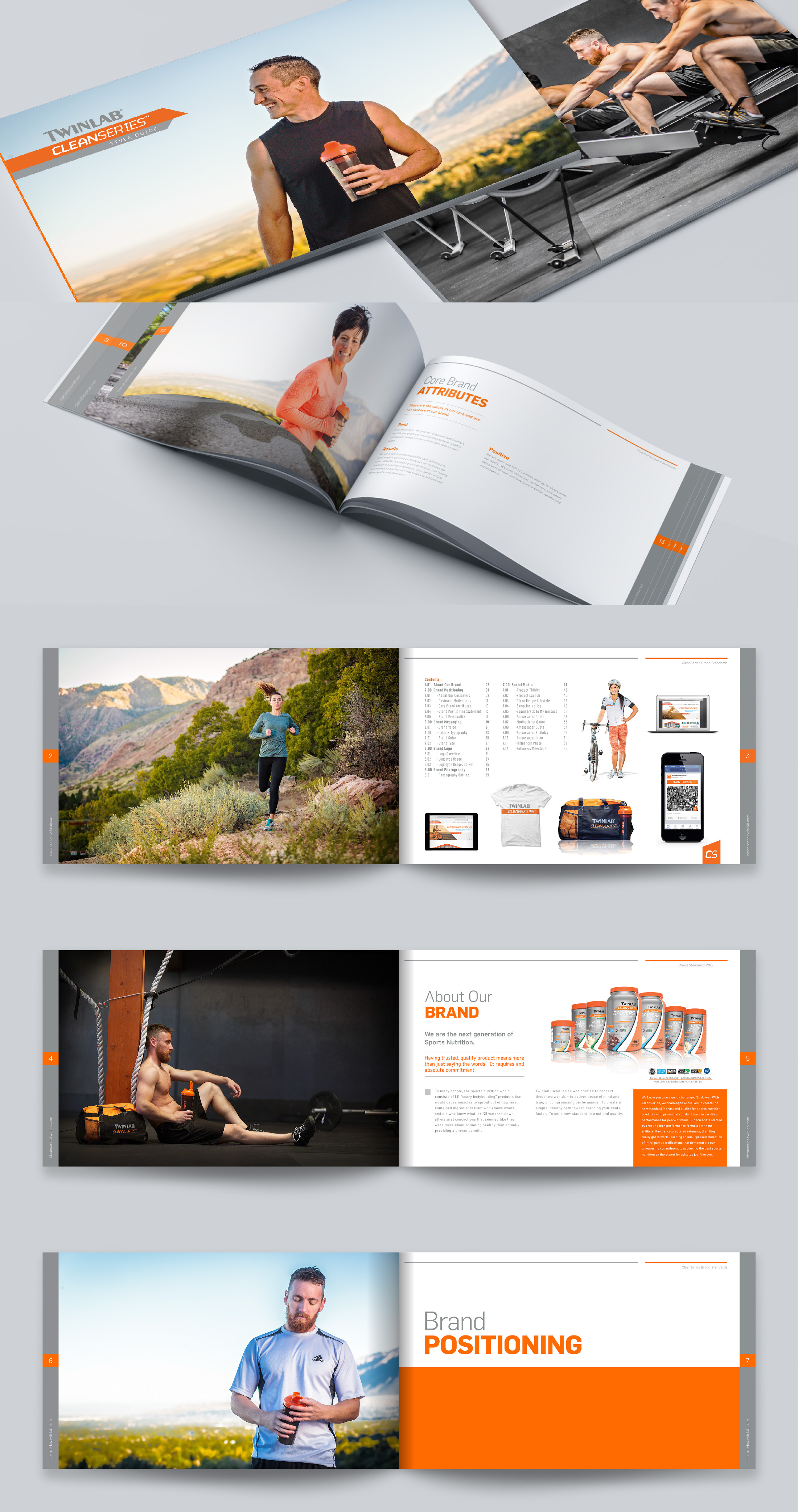


CleanSeries Brand Style Guide
I was tasked with defining a CleanSeries brand style guide. It would encompass all aspects of brand messaging and the overall look and feel of the brand. The packaging and some brand assets like the logo already existed, but they needed to be tightened up, and things needed defining. We were looking to elevate what there was and build upon it.
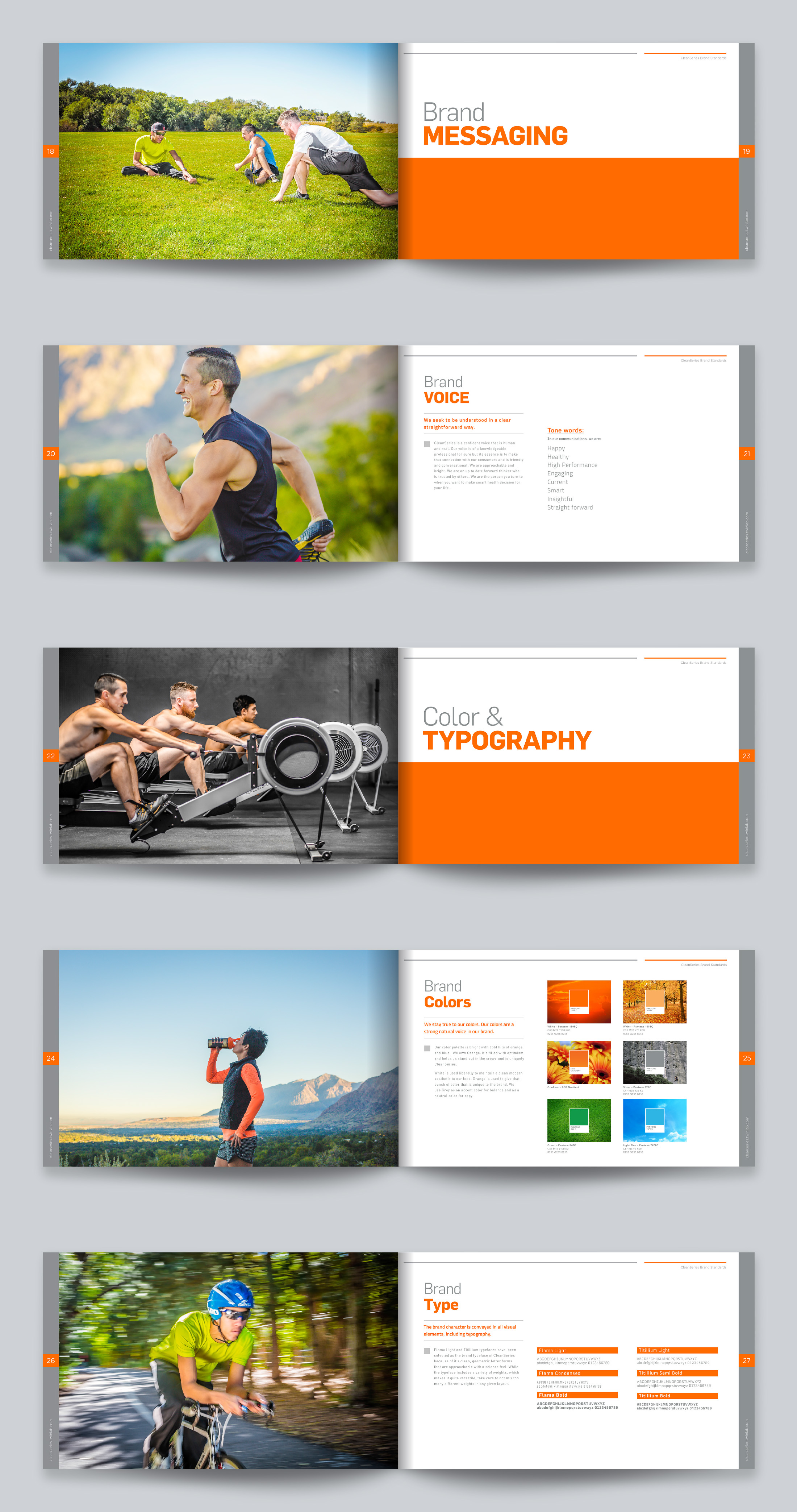
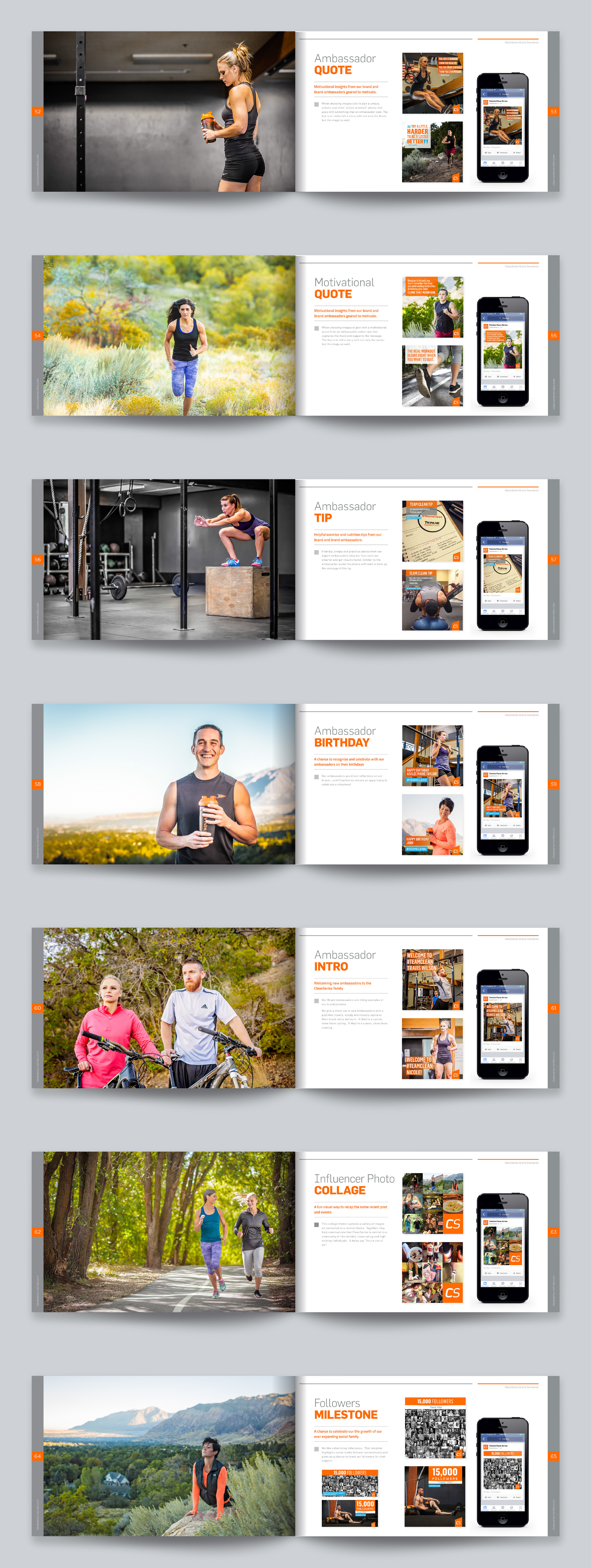
A big part was mapping out a plan for social media and streamlining a system for creating content for social media. What would be engaging to our consumers as well as informative?
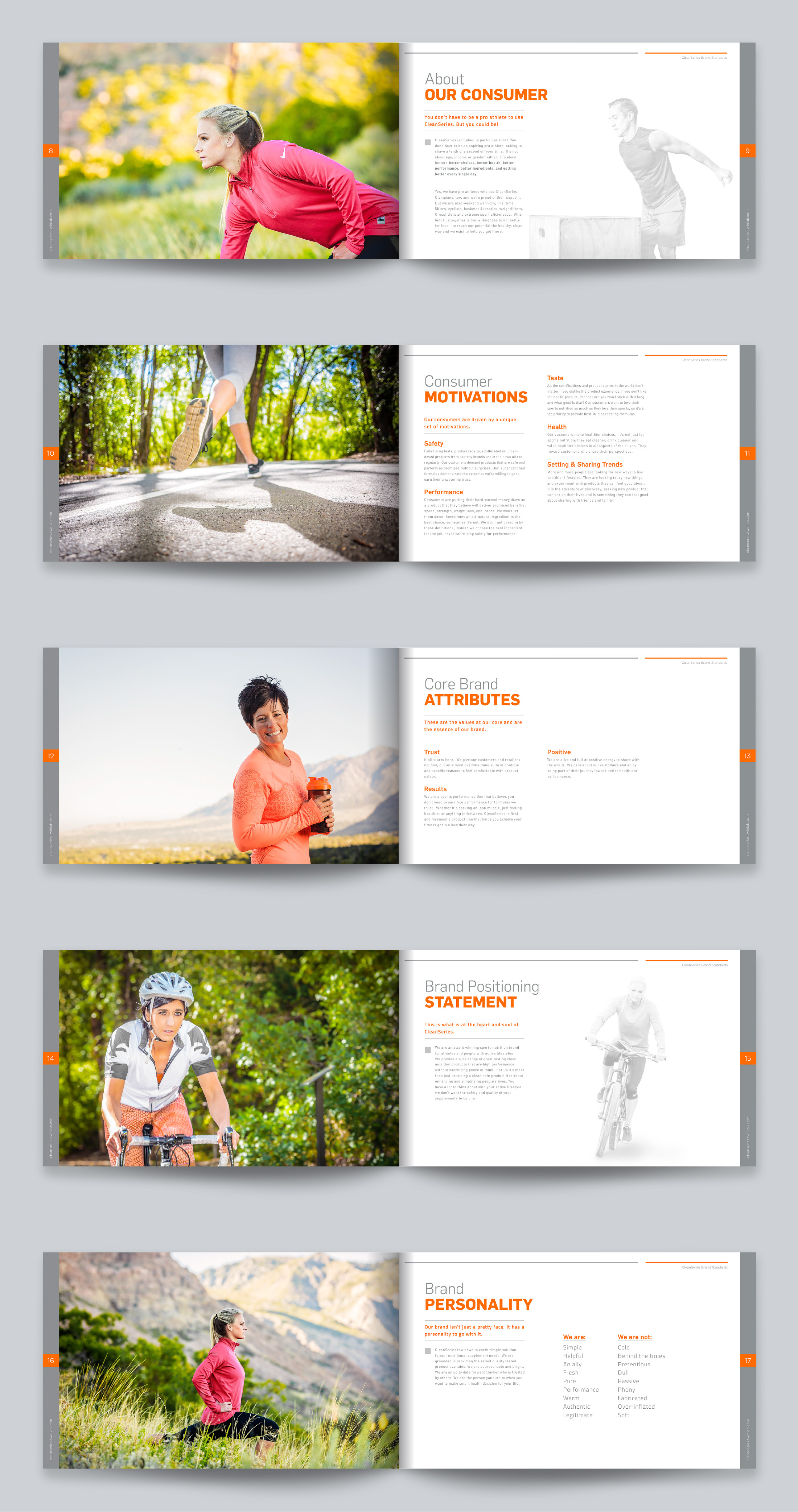
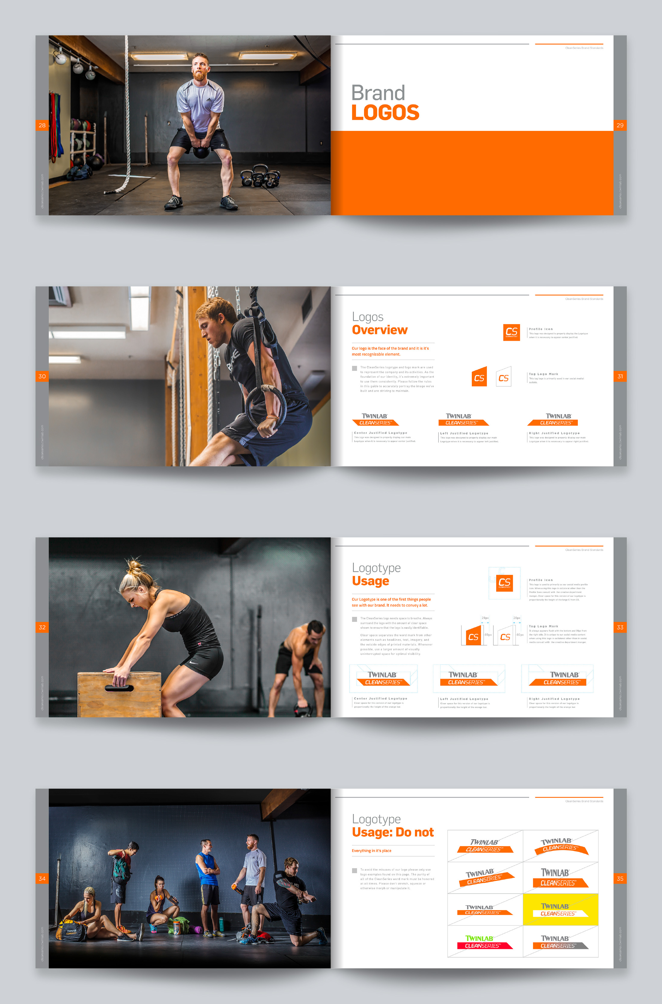
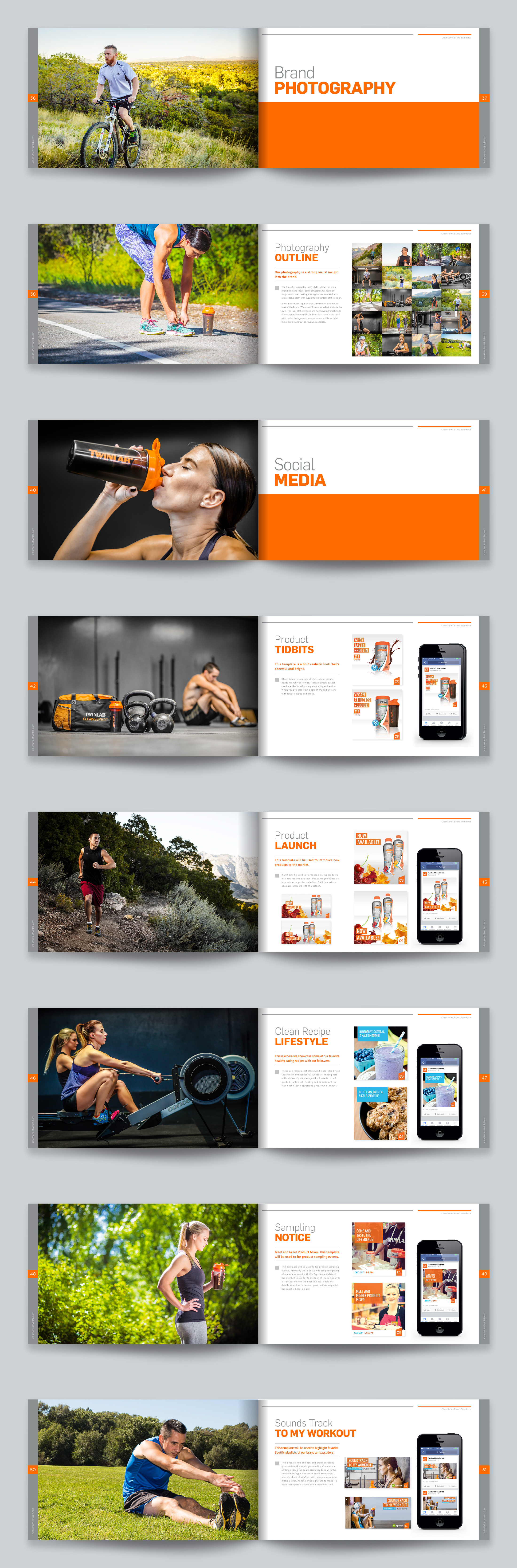
Defining the look and feel of the photography was a big part of the brand's overall look. I organized and planned a photo shoot to help tie in the visuals in keeping with the brand's aesthetics. I shot some of the photography as well.
I wanted the brand to be an experience, not just a superimposed story, to get an emotional response.
During the design phase, I tried to immerse myself in Clean sports nutrition. Capturing the vision and long-term goals of the product line was paramount. I went to GYM's and talked with athletes about what was important to them. I wanted to find out what kinds of things they are looking to get from their nutritional supplements.
Client: Twinlab
Agency: In-house
Creative Role: Art Direction, Photography, Writer, Designer.